Tuesday, February 16, 2010

Into The Game+Softening

Before:


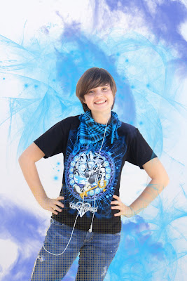
After:

This time I'm comin at you with a more digital approach.

First of all, This was taken outside using a big white board behind me. It was taken by Stephanie. (After this was taken, I realized I do something weird with my legs x6 ) The sun was hitting the Whit board from behind while someone held up a white card to reflect some light onto me. I liked shooting like this. It was a fun experience for me and I learned that it's a great way to get perfect lighting outside if you don't have a studio.

Second, why i did what I did. I chose these three colors from my Kingdom hearts shirt. The way that i decided on these colors were i was so set on using complimentary colors. I would have preferred a black background, but then the resulting image would not have been this piece that I love. The idea I got for this was based off my shirt as well. Using the gold , I started at my feet to give the look that I was either going into or coming out of a video-game. Then I used the blue glow brush to add a kind of video-game-y feel of Fantasy. I left some of the blue coming over my arm to give the feel that I was actually there and feeling the 'smoke' or 'fantasy dust'. Then I included the purple cloud brushes to give more of a Fantasy feel and also to highlight the blue like on my Shirt.

Third, I am very satisfied with this project and would be enthralled to do this again. It was a fun experience and i was glad that i was able to do this at home with my photoshop. In the end, after going through five different ideas and 7 layers, I am pleased with my final product.

Brushes belong to http://www.brusheezy.com/ and whomever created them.

Update!:
Softened:
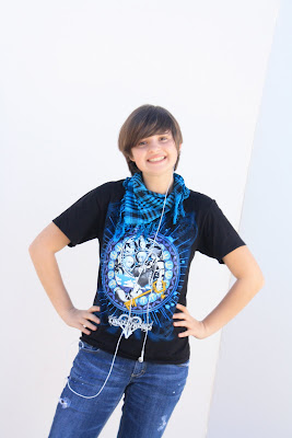
Can you tell i softened it? xD

I was actually to do this really fast because of Ms.Miles amazing teachings and taking notes really helped me.

But for this, we were to take our originals photo and soften it through this process found on PhotoShop Essentials.
It was really easy to do this and it's a great way to help yourself look better .

:)

Friday, February 5, 2010

We love......


We love Mrs. Alvarez!

And We Will Miss her!

:D

Thursday, February 4, 2010

Many Faces of Darri


Last project of the semester. :D
Yay!
I love these shots! My favorite one here is the one with me in glasses. I love that face I fade by accident.

Anyways, this was to make a photo-booth style shots.Mine aren't as creative as the accidental ones I took that I couldn't use which I will upload after my reflection for your Enjoyment.

Anyways, I took these four images and then photoshopped them after a long prosperous journey to get alright looking ones.
......
I actually am not sure of what to say here.
My Faces:
1.Emo/Depressed/Trying to block out the world
2.Cyute Nerd
3.Spoiled princess
4.Normal

Outtakes:
1. *ptlllltlt*
2. Serene music is Serene
3.Lol...Whut?
4. RRRRRR!Darn Cord!!
5.I is Music Player
6. You Know I'm Fab!

Tuesday, February 2, 2010

Sequencing Booklet. "What do the Innocent See?


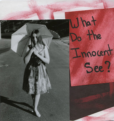
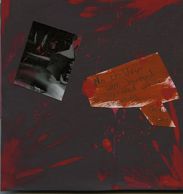
Here are the front and back covers to my booklet from my sequencing project.

My model as always was Christina Cervantes, adorned in an adorable dress as seen on the front cover. The title of my book is "What do the Innocent See?"

I tried to go for a kinda sketchy look for the cover with a bad paint job on purpose.I painted the red onto a pink piece of paper on top of the white and black paper i used for the cover. Then I Placed  the extra image of Christina I took onto the cover to see if it would make a good detail.


+++++

Then when you go to look at the back cover, you can see that i went for a more bloodied look. The small image I used was from the motion project we did not too long ago when someone ran in front of my shot.

On my back cover, you can see the splatter and drips of blood. Also my finger prints. :3

I worked a long time to get this the way I liked it. The orang-ish colored sign says "No children were harmed or perished while shooting" and then a little This time" To give it an ominous feeling. 

Once I pasted on the sign and the image, I splattered more red paint onto the back cover to give it more of the scary, blood covered feel.


++++++


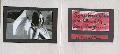
Here is the first image of the book, including a little message to the reader. You see Christina just walking along on a bright sunny day in her pretty dress and umbrella. She looks like nothing is wrong and she could't have a care in the world.

Then you seen the message and you get the feeling that something is going to happen. The message, Saying "Sometimes Children are followed by Scary things,......" and then as an add on "And they don't know it....".

By reading this, one would get an even deeper feeling that something was going to go down.
I had to use a message, because I was one image short, but I like how i incorporated it into my book. Again, I painted a peice of white paper with red paint that was watered up and I purposely  rushed with the painting portion.


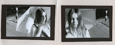
Then you turn to the next images and you see the figure of a person in the background, leaning against the pole as is there was nothing wrong and that it was normal to tail a young girl. In the second image, you seen Christina with a confused expression on her face, as if she feels that something is wrong As she slightly turns her head to look.

And that is where I stop showing you the images. ;p
Major Cliffhanger right?

Anyways, this project was fun to do, but also a pain in the butt, since the first roll I took didn't come out :/
so I had to do the whole thing again. But it was nice to do this project because we could let our imagination run free to think of what to do for the sequencing. My original idea was completely different and would have involved many more pages.

Well, that's all I have for this prodject.