Wednesday, December 15, 2010

So, Here's what's up.

The reason I haven't been updating as often with new pictures is cause I don't have ideas for shoots. 

D;

I have models and locations, just not the ideas I need to perform the shoots! As you know, my theme is fantasy/fashion with an eerie feel. It's difficult to actually find outfits for my models for the shoots I possibly have in mind. 

My possible ides are: 

  • Rapunzel
  • Cinderella
  • The little mermaid
  • The emperor's new clothes
These are the main ideas I want to shoot. It'd be so much easier to do if I had a camera at home, but I don't so that is also why I don't have any new material.
 
Thank you for being patient and reading this. I'll try my hardest to figure out a way to update soon!
 

Sunday, November 14, 2010

Alice in DarkWoodsWonderland

 "Where Is that Pesky White Rabbit?"


Lost in DarkWoodsWonderland


Becoming apart of  the Nightmare

-----

My theme for these images was showing the more darker and twisted side of Alice in Wonderland with the help of model Angie and my assistant Brianda. I used Angie because she isn't the typical image you think of when you think of Alica in wonderland. Which is why i asked her for this particular shoot. I didn't want to portray the commercialized version of Alice in my photos. In each of the pictures I used, I tried not to get her directly in the center, though in the top one she technically is, but to me it works. In each of the images I used scratch and crack brushes to add more to the 'Darkness' i was trying to portray in this shoot.  In the top and bottom images, I added cracking to my model's face to kind of give it that greater feel of weakness and frailtivity to my 'Alice'. With all of the images, I saturated the images and contrasted them till I got the look I sort of liked and then I changed the color levels to all of them. The first two I added more yellw to the image and the last one I took away some red and blue from the image. The top image I added a white rabbit (still going with the Alice in wonderland theme) to try to get the viewers mind going and to try and find the rabbit as the title suggests to do ("Where is that Pesky White Rabbit?").  The last image has the chainlink fence in it to get of a more urban feel to the image, again to destroy the commercialized 

The lighting at the time when I took these images couldn't have been more perfect if I wanted to be. It was bright out with barely any clouds out. With the bottom image (which I actually took before the others), I had my assistant Brianda use a gold cad to shine a reflection onto my model to capture her face better in the shaded area. I think I could have done that with the top image too (which I took after the other two) to capture the top part of her face that was shadowed by her hair. All my angles in these images are pretty strait forward. I just had my camera either horizontal or vertical and shot.  But I decided to go with a horizontal angle with the top image to get more of the image to get a feel of searching. 

These images I think are the best I have taken yet. 

<3 Darri

Wednesday, November 3, 2010

Friday, October 22, 2010

The Cake Is Not A Lie


The central idea behind this piece is to show the happiness that simply things, like cake can express. In this image you see my model Brianda eating the cake I prepared the night before. I tried to get her as relaxed as possible to get the feeling of ease and joy that cake can bring someone. I used a soft strobe light and a white background to get the feeling of softness and simplicity. To get the angle I got, I sat on the ground beside the strobe to try and get all of her in the shot while getting the discarded cake lid on the floor in the shot as well. When I took this image home, I eddited it by softening the image and giving a blue tint to everything, except my model, the cake and the lid and  playing witht he saturation a little bit. 

This image goes directly with my new idea on the concept of showing the simple things that make people happy that people don't really pay attention to. This concept has completely changed from my original idea of fashion photography with a fantasy twist on it. Now I'm trying to focus on Portraits and the simple things. In creating this image, I tried to stick with my idea, but I found it difficult to get it so my model looked relaxed and actually in the moment happy. But I'm ready to take this challenge. From here I am going to continue on with this concept but my next ideas are : Bubble/Bubble blowing and Cloud watching. What I'm going to try to do with those inmages is get more color into them a bit, but keeping it not that photoshopped.

The image below is another image from the same shoot, but with more play with saturation and greying the image. The ony thing I didn't satrate or grey at all was the cake to get more of an emphasis on it.

Thursday, September 23, 2010

Portfolio Proposal + Test Shot For Portfolio

Summary of Request:

Proposed by:Darrian Adine Major(-Walker)
Project Title: What the Eye Denies
Class: Period 1 Photography 3
Instructor: Ms. Miles
Project Due Date: January 31, 2011

Project Description

Type of Work: Fashion

Concept
 My concept will be revolving around fantasy and fashion combined. Why Fantasy? Because fantasy in the world is becoming more and unnoticed due to people pushing it away for technology or the fact many don't want to feel foolish in being the one who's always daydreaming and being different. Why Fashion? Because people in society are naturally drawn to beauty. And when most people think of beauty, they think of fashion. It adds on to my love of fashion photography. So I decided to combine the two to demonstrate this disappearance of an important thing people need. I will be using many different kinds of people, mostly those in a smaller and more frail stature to give the sense of innocence to the image, while still demonstrating that Fantasy feeling to it. I will be using other people of different statures  to show that anyone can have an imagination.

Vision
When I complete this portfolio, I want people to see what Is becoming of the world now and how today's youth are losing their right to imagine and fantasize. Adults today in the corperate world are trying to shove the fact that life is hard on young children, and then they grow up, also like an empty shell that mirrors what society wants them to be like. I grew up surrounded by storybooks about fairies and dragons and the liking and my minds always a buzz with new ideas. Having an imagination as a child helps with keeping that buzz of ideas as an Teen or even adult. That's what I want people to realize.

Inspiration
All my inspirations are from stories and storybooks and my own wild and crazy imagination. Fantasy is my favorite topic when it comes to reading. It gets my mind on such a rush. I want others to experience the same feeling. I want others to feel the power and warth Fantasy brings to one's heart.

Equipment to be Used
I am not sure Yet of what kind of cameras, but definitely Cameras, possibly strobe and hot lamps.

Presentation
Unknown

--------
Test Shot
Model: Christina Cervantes
Taken By: Myself
Theme: Dieing Princess
Title: "The Fallen"

Tuesday, September 14, 2010

A New Year....

Welcome to the 2010-2011 Year of Darri's (aka My) Blog~
-^w^-

Above picture was taken by Christina Cervantes on 9-10-10.
Edited by Me.

Thursday, May 27, 2010

A Moment Alone

"A Moment Alone"

Model: Christina Cervantez
Taken By : Me

Wednesday, May 26, 2010

Una pequeña oración

"Una pequeña oración" ( A Little Prayer)
Model: Christina Cervantes
Taken by: Me

Around SDSCPA.....


These Pictures are from when Ms. Miles set us free to roam about the campus and to find as many interesting angles and shadows and different things around school. These are my favorites.
■▪■▪■▪■▪■
The first one up top is of one of those Pink flowers everyone sees in the back of the campus. Does anyone know what kind they are? They've always brought alittle smile to my face as I walk past them from Photography to Biology and also through out the years. ... I know it's in the center of the shot, but It isn't excactly straight so that makes it okay...right?
♫♪♫

The second on is of the tree in the Sixth-grade"Senior" Circle. At this point my parter had left me to use the facilities, so I was free to wander on my lonesome for a bit. So I wanted to take a few of the tree, since I have such fond memories with it. So this is my favorite out of th efive I took of it. I didn't intentionally mean to get the shine from the sun in the shot, but It turned out beautiful in the end result. I also really like how I made it look like a massive tree like the ones you se ein the forest. :3

♫♪♫

The third is one of the shoes I wore that day underneath one of those benches surrounding the "Senior" Circle. I was going to originally take this picture from more of an aye level thing, instead of Bird's eye, but then I had the sudden urge to look through one of the little holes in the bench down at my shoes. I like this shot because the hole in which I looked through made a little frame for my shoes and also the contrasting patterns of the holes from the bench and the lines on the inside of my shoes. Then theres also the line made by the shadow and also the straps to my shoes. I am quite pleased with it.

♫♪♫

The fourth - sixth ones are of a branch with dead leves on it with the pillars of the circle of the sun in the back ground. #4 or #6 was my favorite, but I don't really remember right now. :/
Anyways, #4 i took with the flash on. #5, I'm not sure what I did actually. #6 I focused on the leaves alone.

■▪■▪■▪■▪■

That's all for this assignment. Till the next.
-Darri

Tuesday, May 4, 2010

Group Project

Though I wasn't here for the actual shooting of this project. I helped decide on how we were going to set it up and helped to remind people to bring what they promised to bring.

In this project we were assigned to  try and fit in all the arts of this school in one image to tell about how diverse, but closely knot this school is with the arts. In this shot, we have the visual arts, dancing arts and musical arts. It was taken before the tree that everyone on campus knows as the senior circle. I chose this image sine I liked how it portrayed each art in it's own way and also layered, so that the musical arts in in front playing for the dancer as she dances for the artist who is drawing her. It all fits together.

The only thing i do not like about this shot is the fact that the dancer isn't in the middle of the artist and musician. I trhink it would have been more successful that way. Otherwise , it would have been better to me.  With the light coming in through the tree's branches, it gives it a softer look to me. It's almost heavanly.

Another problem I can see is from my own printing. I was limited on time (i might have had only three minutes total to expose and print this) and I went up to 45 seconds on exposing it. This is the first print to be such a pain in the put to me. :(
For when I do another project like this, I'm going to make sure it's on a day that I don't have a dentist appointment and that i have enough time to actually plan out a shoot, because the whole time planning this wth my group, we kept hitting more and more problems, one right after the other. :/

Well, that's all I got on this peice. Thill the next one.
+Darri 

Tuesday, April 6, 2010

About Portraits....

On the topic of Portraits, they are a deep form of someone's picture. They aren't like a snapshot where your chilling with your friends in a picture and having a great time, maybe even posing everyone and thenk taking a picture. +click+ No. A Portrait is alot deeper than that. It has meaning. When you take someone's portrait, your supposed to see and feel their emotion in the picture. Your supposed to see how they are feeling, in their eyes and in there face and posture. Let it be natural. When It' sposed, it's not as emotionally satifying as it should be. You don't get the sense that you know the person on a higher level, even is that person is a complete stranger to you. When your able to look at a portrait and are able to get inside the person's soul able to see that they are hurting or happy, it's truly incredible. If you havn't noticed, the word "portrait" has the word "Trait" in it. To me that means that you should be able to read someone's traitsor emotions from their portrait. Maybe that isn't the case every portrait, but thats what it means to me.

Thursday, March 4, 2010

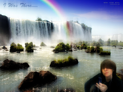
I Was There.....


I totally was! :D

Anyhoo,.....This was something we did today in photography. We had to take a picture, possibly the ones from before with the white background or one with photobooth.

I had to take mine with photobooth because the one with the white background is at home. ;^;

Anyways, we had to get our picture on a background and then choose two tricks from photoshop essentials and 1 word or number in the back somewhere.

This pic of me : Because I thougt i looked fuuny xD

The background: I found it and instantly loved it! I love waterfalls!

Phrase: It instantly stuck in my head while looking at this image and I used it. :3

Two tricks I chose:
1.

Painterly Glow Effect With Smart Filters

2.

Add A Realistic Rainbow To A Photo


This was truly a fun thing to practice photoshop with.

Tuesday, February 16, 2010

Into The Game+Softening

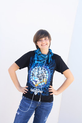
Before:


After:

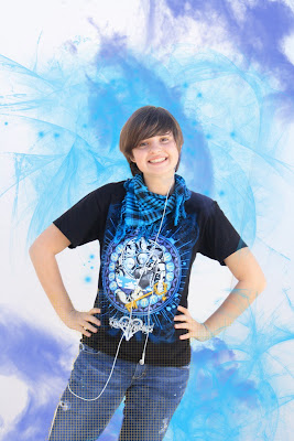
This time I'm comin at you with a more digital approach.

First of all, This was taken outside using a big white board behind me. It was taken by Stephanie. (After this was taken, I realized I do something weird with my legs x6 ) The sun was hitting the Whit board from behind while someone held up a white card to reflect some light onto me. I liked shooting like this. It was a fun experience for me and I learned that it's a great way to get perfect lighting outside if you don't have a studio.

Second, why i did what I did. I chose these three colors from my Kingdom hearts shirt. The way that i decided on these colors were i was so set on using complimentary colors. I would have preferred a black background, but then the resulting image would not have been this piece that I love. The idea I got for this was based off my shirt as well. Using the gold , I started at my feet to give the look that I was either going into or coming out of a video-game. Then I used the blue glow brush to add a kind of video-game-y feel of Fantasy. I left some of the blue coming over my arm to give the feel that I was actually there and feeling the 'smoke' or 'fantasy dust'. Then I included the purple cloud brushes to give more of a Fantasy feel and also to highlight the blue like on my Shirt.

Third, I am very satisfied with this project and would be enthralled to do this again. It was a fun experience and i was glad that i was able to do this at home with my photoshop. In the end, after going through five different ideas and 7 layers, I am pleased with my final product.

Brushes belong to http://www.brusheezy.com/ and whomever created them.

Update!:
Softened:
Can you tell i softened it? xD

I was actually to do this really fast because of Ms.Miles amazing teachings and taking notes really helped me.

But for this, we were to take our originals photo and soften it through this process found on PhotoShop Essentials.
It was really easy to do this and it's a great way to help yourself look better .

:)

Friday, February 5, 2010

We love......


We love Mrs. Alvarez!

And We Will Miss her!

:D

Thursday, February 4, 2010

Many Faces of Darri


Last project of the semester. :D
Yay!
I love these shots! My favorite one here is the one with me in glasses. I love that face I fade by accident.

Anyways, this was to make a photo-booth style shots.Mine aren't as creative as the accidental ones I took that I couldn't use which I will upload after my reflection for your Enjoyment.

Anyways, I took these four images and then photoshopped them after a long prosperous journey to get alright looking ones.
......
I actually am not sure of what to say here.
My Faces:
1.Emo/Depressed/Trying to block out the world
2.Cyute Nerd
3.Spoiled princess
4.Normal

Outtakes:
1. *ptlllltlt*
2. Serene music is Serene
3.Lol...Whut?
4. RRRRRR!Darn Cord!!
5.I is Music Player
6. You Know I'm Fab!

Tuesday, February 2, 2010

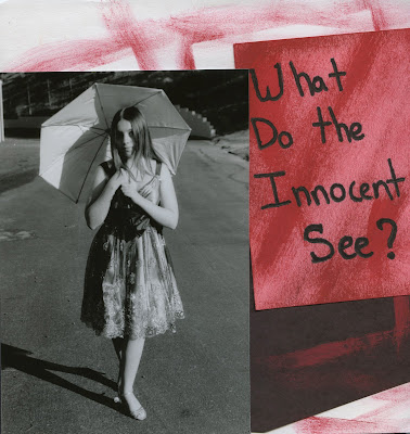
Sequencing Booklet. "What do the Innocent See?


Here are the front and back covers to my booklet from my sequencing project.

My model as always was Christina Cervantes, adorned in an adorable dress as seen on the front cover. The title of my book is "What do the Innocent See?"

I tried to go for a kinda sketchy look for the cover with a bad paint job on purpose.I painted the red onto a pink piece of paper on top of the white and black paper i used for the cover. Then I Placed  the extra image of Christina I took onto the cover to see if it would make a good detail.


+++++
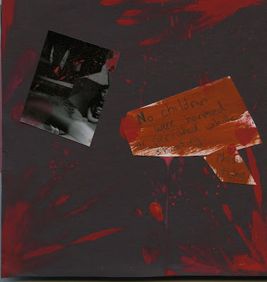
Then when you go to look at the back cover, you can see that i went for a more bloodied look. The small image I used was from the motion project we did not too long ago when someone ran in front of my shot.

On my back cover, you can see the splatter and drips of blood. Also my finger prints. :3

I worked a long time to get this the way I liked it. The orang-ish colored sign says "No children were harmed or perished while shooting" and then a little This time" To give it an ominous feeling. 

Once I pasted on the sign and the image, I splattered more red paint onto the back cover to give it more of the scary, blood covered feel.


++++++
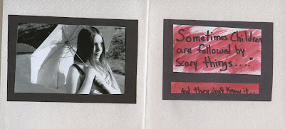


Here is the first image of the book, including a little message to the reader. You see Christina just walking along on a bright sunny day in her pretty dress and umbrella. She looks like nothing is wrong and she could't have a care in the world.

Then you seen the message and you get the feeling that something is going to happen. The message, Saying "Sometimes Children are followed by Scary things,......" and then as an add on "And they don't know it....".

By reading this, one would get an even deeper feeling that something was going to go down.
I had to use a message, because I was one image short, but I like how i incorporated it into my book. Again, I painted a peice of white paper with red paint that was watered up and I purposely  rushed with the painting portion.
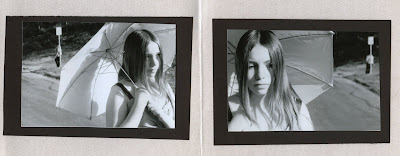

Then you turn to the next images and you see the figure of a person in the background, leaning against the pole as is there was nothing wrong and that it was normal to tail a young girl. In the second image, you seen Christina with a confused expression on her face, as if she feels that something is wrong As she slightly turns her head to look.

And that is where I stop showing you the images. ;p
Major Cliffhanger right?

Anyways, this project was fun to do, but also a pain in the butt, since the first roll I took didn't come out :/
so I had to do the whole thing again. But it was nice to do this project because we could let our imagination run free to think of what to do for the sequencing. My original idea was completely different and would have involved many more pages.

Well, that's all I have for this prodject.